March 28, 2007

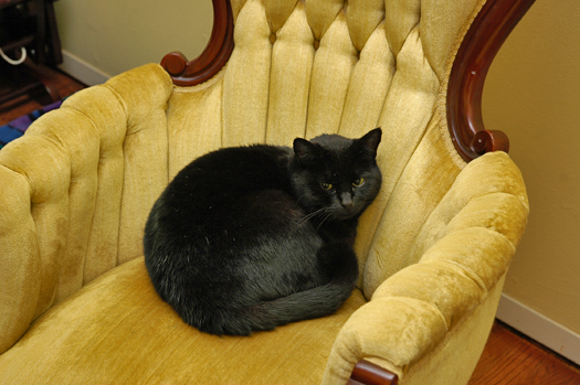
I had this feeling like I should change the subject (although holy shit you guys crack me up). Hey look! It’s Cat, baleful and no doubt plotting to eat the flesh from our faces:

22cat.jpg

And Dog, demonstrating all that is stupid and good in the world:

22dog.jpg

Also, the boy is suspicious (FOR A CHANGE):

22susp.jpg

So I could use your opinion on some kitchen-remodel stuff. First, what do you think of the paint color on the left?

22pt.jpg

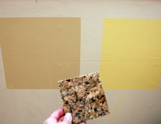
That is Benjamin Moore’s Powell Buff, the right color is Golden Honey or something like that. Too yellow, I think. The granite color is in front, I think the Powell color looks pretty good with it but as I’ve stated before, I’m kind of a dumbass about this stuff.

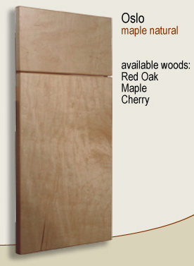
We also have to decide what sort of built-in furniture we’ll be putting into the small breakfast nook that will be built. JB likes this style:

22nook.jpg

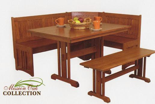
It comes from this website, we can basically ask the builders to match some existing design. What say you, would that type of nook seating go okay with the cabinet style we’re choosing?

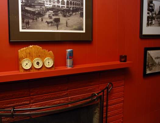
Finally, I’d like to state for the record that not only is it never too early to start with the Red Bull, apparently in our home there exists a helpful Can Pickup Fairy whose job it is to trail the male adult all around the house tidying after his little aluminum remains. I can think of no other explanation, anyway, for THIS:

22can.jpg

Comments

69 Responses to “Decisions, decisions”

  1. jen on March 28th, 2007 8:28 pm

    i like the powell buff. looks good with the granite.

    suspicous boy= hahahah!

  2. flicka on March 28th, 2007 8:35 pm

    powell buff all the way. screw the yellow!

  3. Daily Tragedies on March 28th, 2007 8:40 pm

    Love the table for the nook, but Mission is definitely a different style than your very contemporary cabinets.

    Does the Can Pickup Fairy have a sister — the Wipes Crumbs From the Counter Fairy? Because my roommate apparently thinks she frequents the place.

  4. kim steppe on March 28th, 2007 8:46 pm

    not liking the powell buff color, think it would make the room too blah. However, hate the yellow. I’d look at other colors, Daly’s on Stone Way in Freemont used to allow you a small size of paint (yes, smaller than a quart) to test on your wall. I’ve remodeled three homes and been happy with the last two. I love color but would go a route that pulls something else out of the granite. The powell buff is boring, you are definately not boring, right?

  5. Kathryn on March 28th, 2007 8:48 pm

    What about a terra cotta-ish color? It looks like there are flecks of it in the granite, and it could be warm and pretty. Otherwise, my vote’s for the Powell Buff.

  6. Jo on March 28th, 2007 8:57 pm

    Yah for Cat pictures, gotta love how they can look cute and evil at the same time.

    Powell Buff gets my vote too, I’d steer clear of the yellow

  7. Chiara on March 28th, 2007 8:59 pm

    I loved my little yellow formica kitchen back in my Lake City (holla!) days, so I am going to vote for that, even if I think it looks a little weird with the granite chip thing.

  8. Erica on March 28th, 2007 9:01 pm

    Coming from someone who has a yellow kitchen (and detests it) I have to say the buff.

  9. Jane on March 28th, 2007 9:06 pm

    I have to be honest about the nook - looks a little Church Pew-ish, and like perhaps it might be a little uncomfy? Hard straight wood seat and back… ouch.

    Prefer the tan to the yellow in the paint.

    Shutting up now.

  10. Jane on March 28th, 2007 9:07 pm

    PS: Just on the nook furniture again (had another quick squiz) - is it just me or does the table look too high for the seats?

  11. Katie (The Yap) on March 28th, 2007 9:18 pm

    Hmmmm…I really love yellow kitchens with dark granite, but I’m not sure that shade or yellow quite works. I would pick the buff, but I am liking the terra cotta suggestion…although that might not work with your red walls.

    How about a cross between beige and yellow? Like more of a camel color?

  12. Chloe on March 28th, 2007 9:33 pm

    I don’t think that shade of yellow would look good with your countertops. But I think that beige shade will make the room dark, and maybe a bit small looking, and perhaps a bit blah? I’d definitely look for another option… Would orange be too crazy? You’d have to carefully look at it with your red wall to insure no clashing, though… the camel color Katie suggested sounds like a worthwhile idea too.

  13. Keaton on March 28th, 2007 9:34 pm

    I like the browner color. Also, I like the design, though the back on the booth looks slightly uncomfortable. Padding, maybe?

  14. Pete on March 28th, 2007 9:38 pm

    I like the Powell Buff. As far as the nook seating goes, we have that model (sans bench) and hated it. You can have it for shipping. It’s a major PITA to get in or out, the table is unstable and hard to slide (when you have to get out). It’s now in the game room taking up space.

  15. Sonia on March 28th, 2007 9:47 pm

    I like the buff paint color on the left with your granite. Hell, I like the buff color without your granite. And so I painted my entire kitchen, dining room and great room with it. :-) It’s very warm and nice. And boring, but I don’t care. You can always add accent colors to such a nice warm neutral.
    On the built-in….I like it. But? I’m thinking it’s 180 degrees from your cabinet style. You’d mentioned that it was a small space that the built-in would go, and I’m wondering if you might find the mission style too busy? (That seems weird to say, as mission style is inherently simple, no?) There is a lot of detail on the one in the photo sample. I hope none of this sounds jerky.

  16. Cali911Gal on March 28th, 2007 9:58 pm

    Go with the buff.

    I did a bathroom in that color yellow, and ewwww

    Overpowering. (And since re-painted over in white…)

  17. angela on March 29th, 2007 12:29 am

    That cat is a zombie! AHHHHH!

  18. Nicole on March 29th, 2007 1:01 am

    I also think the buff would be too blah with the color of the cabinets. I like a yellow, just not that yellow. I am thinking something that looks a bit more honey/caramel colored. As long as it is a color strong enough to match the red in the living room.
    I agree that the mission stuff does not seem like it will go with the cabinets.

  19. thejunebug on March 29th, 2007 1:46 am

    How about black for the kitchen walls? Really! Or at least the main wall where the cabinets are? No? Hehe.

    I also really like the breakfast nook that JB picked out.

    And I have to say, Meercat looks really snuggly fat & soft. I just felt a lump where I think my cat’s cancer has come back, three months after surgery, so I’m feeling a little sentimental and sad. I guess if I tried snuggling Cat she’d rip my face off & then drag it under the couch, but then that’s the beauty of cats. ;)

  20. Gentry on March 29th, 2007 2:00 am

    DO NOT DO YELLOW.

  21. wn on March 29th, 2007 5:07 am

    Definetly like the Powell better than the yellow…

    HOWEVER….since you need to match with red….

    Have you thought of a beige/brown that has a hint of grey. Something a bit darker and richer. I was thinking Copely Grey in the 2007 colors ( http://www.benjaminmoore.ca/colours/2007_colours.aspx#) ? It would be bold….but then again, I don’t think you tend to shy away from color…I mean you do have a red fireplace and all!!!

    As for the nook, I think I would go with the rustic style…but I would ask the builder to NOT insert the slate tiles…and replace with wooden squares. I like the style of the rustic (neato lines and from what I can understand on the website…the rustic is more tactile and a bit rougher in the ultimate finish) and I think it would make a nice contrast to the sleek style of the cabinets….

    Good luck!

  22. wn on March 29th, 2007 5:13 am

    Chelsea Grey would work too!
    OK, I’lll shut up now!

  23. Paula on March 29th, 2007 5:19 am

    Everyone has a different opinion on paint so I will leave that subject. On to the breakfast nook. If you can get a carpenter to customize it, why not add storage under the seats?

    I call the can a “crumb”. My husband does NOTHING in life that does not leave crumbs. Drink a can of pop; there is a can that hasn’t been put in the trash. Fix a leaky faucet in the kitchen; the contents of his toolbox are scattered throughout the 1st floor, all of my dish towels are under the sink soaking wet, and the packaging for every new part for the faucet is blowing in the breaze outside our kitchen door. It drives me bat shit crazy. If you can explain it, I will hug you. If you can fix it, I will pay you. Period.

  24. biodtl on March 29th, 2007 5:40 am

    So THAT’S where the pickup fairy has been! I was wondering, since she;s been slacking over at my house.

  25. Sarah on March 29th, 2007 5:45 am

    We painted our living room with a ‘buff’ type color (I think a little lighter than yours) and really like it. I’ll have to find the name. Otherwise, I think I tend to agree with the others - the buff is too ‘blendy’ and the yellow is too yellow. And the nook does look like church. Helpful, aren’t I!?

    I really want to comment on dog. I’m so glad to see her photos because I want to make sure she’s not being forgotten (we have a dog and are expecting a baby next month, and everyone says once baby arrives, the dog is ignored….and I can’t imagine it!). So it’s nice that she still features in your photos :)

  26. Allison on March 29th, 2007 6:13 am

    A big NO to the yellow. You’ll get sick of it quick. Plus, didn’t you want something that would look nice with the big red wall? Two primary colors seen together might looks, well, a little dumb.

  27. filakia on March 29th, 2007 6:25 am

    I like yellow as a color, but I am not a fan of the particular yellow in your photo with the granite. The brown is better and looks good, but maybe something slighly lighter?

    I like the nook furniture and I think it would be just fine with the modern cabinets. Both cabinets and furniture are clean and simple, and while they may not be the same design style, they are harmonious styles. Besides, I don’t think it’s necessary to match everything up perfectly; however, had you chosen fussy Louis XIV-type nook furniture, I would have to revise that answer. There are limits.

  28. ang on March 29th, 2007 6:30 am

    I would look for something in between the two colors. I like the buff better with the countertops, but maybe a little bit lighter shade with a hint of golden yellow in it?? Not so buttery.

  29. Lawyerish on March 29th, 2007 6:39 am

    The yellow is a no, I’m afraid. The buff is very nice and looks great with the granite.

    I’m not sure about the Mission deal with the contemporary cabinets. It also might get a little too….woody? In there?

    Incidentally, if you need extra kitchen storage, they make these upholstered banquette/booth thingies where the seat pulls up and the bench is hollow so you can store crap in there.

  30. filakia on March 29th, 2007 6:44 am

    Sorry to post again, but I have some paint suggestions. I’m not sure these are going to be the right shade of brown — it’s hard to tell from a photo of a small piece of granite — but I’ve used these colors in two different houses, in different rooms, and I think they look very nice on the walls. I’ve even gotten compliments on the shades, and they’re just brown, you know? Also, the second one sometimes looks kind of golden in certain lights. Try painting a tad on the walls like you did above and see what you think:

    These are from Lowe’s, Olympic brand paints, the first is C13-2, Almond Paste, and the second is from the same paint strip, C13-3 Earthy Cane. If you can’t find the strip, see if Lowe’s will mix it for you, anyway. They’ve done this for me for another paint color they “discontinued.”

  31. bad penguin on March 29th, 2007 6:57 am

    I vote for Powell Buff, definitely. I don’t think the yellow works with the granite.

  32. Becky on March 29th, 2007 7:31 am

    OMG I love DOG!!!! To be that happy!

    As for CAT…she has the stare down perfect!

  33. Caitlin on March 29th, 2007 7:32 am

    Yellow is awesome for kitchens–makes them bright and big and you cook scrambled eggs more often.

    Also–who turned your baby into some kind of lumberjack boy-man?! With a manly hole in his big boy jeans, ah, the ovaries!!

  34. Danell on March 29th, 2007 7:37 am

    How about the yellow that is the background color of this site? Less yellow-y than the chip shown, but maybe a little warmer than the buff chip. Or maybe it just looks that way on my screen.
    Anyway, my kitchen is merlot and my foyer is bright-ass terra cotta…kind of obnoxious but it felt pretty cheery when we painted it that color in the middle of this dreary winter. So, I like color.

  35. Jamie on March 29th, 2007 7:40 am

    I would have the store mix a little cream color paint into the Powell Buff - it’s a teensy bit dark, and when you throw it up against your warm cabinets and warm granite, you run the risk of having it all look like a big Powell Buff vomity blob. If you lighten the PB without changing it’s tone, you should be good to go. A little contrast never hurt anyone.

    Also: that yellow is beautiful. But not for your kitchen. Aack.

    I can’t believe no one has commented about how deliriously happy the dog looks in that photo. What a smile!

  36. Omu on March 29th, 2007 7:46 am

    Yellow is fine, but not *that* yellow. A friend once had the best yellow ever in her house. When I asked what shade it was, she told me she actually used a cream color, but after it was painted it looked like a nice, buttery yellow. So maybe try cream? Or look for a more toned down yellow. Or go burnt orange. :)

    Does anyone else watch home remodeling shows? I’m still haunted by one I watched where the interior designer shreiked, “Why the hell does everyone paint their kitchen yellow?!?!” I’m considering doing it too, but I can’t get that shriek out of my head long enough to actually paint mine yellow.

    I like the furniture, but I do agree the storage underneath would be nice. My grandma has that, and it’s really handy!

    Cat! Dog! How I love thee!! And suspicious boy is always a hit!

  37. Lisa-Marie on March 29th, 2007 7:49 am

    The Powell Buff is perfect with the tile, and the furniture is awesome (I’d love that in my own home), but I think you’d want to try to match your cabinets. Nice choices!

  38. Susie on March 29th, 2007 8:11 am

    Love the buff — it looks great with the granite. Not a fan of the yellow and it’s really hard to work with — my husband and I painted our bedroom three times before we got the right shade of yellow. LOVE the nook furniture (big fan of mission style), but if I were choosing, I’d want it to match the cabinets.

    My husband does that all the time — not so much with cans, but pretty much Every. Thing. Else. Drives me insane. I hope you have better luck breaking yours of the habit than I’ve had with mine…

  39. Amanda on March 29th, 2007 8:16 am

    I think the buff color is going to look green when it’s up in all its glory. I would go with a cooler color. And I agree with the commenter who said that the nook stuff isn’t in keeping with the sleek cabinets. Here’s what a tool I am, I’ve gone to the Benjamin Moore site- I would explore:
    Dorset Gold, Concord Ivory, Chestertown Buff and Goldfinger.

    As for the nook, just envious you have the space, chutzpah and cash to be doing the remodel. Enjoy!

  40. jonniker on March 29th, 2007 8:44 am

    Filiakia: My bedroom is in Lowe’s Almond Paste, and while I love it - LOVE IT - I have to say, it was a total bitch to put up. Olympic Paint is not the best quality I’ve ever used, and looking back, I wish I’d used something better. I had to use something like 12 coats of paint to get it even.

    That being said, the color is awesome, and Sundry, I think it might be exactly what you’re looking for.

    (I, too, am a little frightened by the comfort of the nook furniture. My back gets creaky thinking about it. And my butt. )

  41. MRW on March 29th, 2007 8:46 am

    I wonder if this is the same person as the laundry fairy who magically refills my husband’s underwear and sock drawer every week or so. When there are no clean socks or underwear, spouse is mystified…

  42. breckgirl on March 29th, 2007 9:42 am

    Now don’t be counting out yellow tones just yet! I am generally not a fan of yellow (I mean, really, who looks good in yellow?) BUT we painted our bathroom a fabulous creamy yellow in our home in Portland and I loved it. It was Ralph Lauren paint (pricey, but very good paint) and I cannot recall the exact name - I think it was “Chamois” but I am not positive. It was a warmer, buttery yellow - the one you show is too yellow, needs more cream to it. Anyway, that’s my two cents. You should check out Ralph Lauren’s paint colors - I know they sell it at Home Depot and Lowes. The nook is darling. You guys are so lucky to be able to do all of this stuff to your house. I am insanely jealous. And isn’t “baleful” such a great word to use when referring to a cat’s stare? Love it.

  43. warcrygirl on March 29th, 2007 9:45 am

    I like the yellow but not with that counter top; go with the Powell Buff. Also: Red Bull:Red Mantle. Hubby once told me that he didn’t have to do housework, that’s what he had me for.

  44. Melissa on March 29th, 2007 9:54 am

    So glad you asked for opinions, right? :) I like the buff. Love the idea of the nook but wonder if it’s not quite modern enough for the cabinets. I really like the cabinets.

    Cat, Dog, and Riley all look so cute…love the pic of Dog!

  45. Niki on March 29th, 2007 9:59 am

    I’m glad to see I’m not the only one who has reservations about the buff.

    You are correct, the yellow looks terrible, especially with the granite. But I don’t see the buff working at all. I’ll chime in with those who suggest a cooler color. A buff-ish color sounds fine, but something softer seems better. Maybe a buff with just the slightest bit of pink? I dunno. In any case, try to take a color in the granite and find paint to either match it, or paint that is slightly darker or lighter but is clearly evoking a particular color in the granite.

    I really think you’ll be unhappy with the buff. (We will not speak of the yellow.)

    Oh, and just to chime in on the seating nook: Mission is classic turn of the 20th century styling; this will *not* work with sleek modern. Look closely at the little, um, bars in the styling. They’re made to go with built-in cabinetry, chair rails, etc. (I think.)

  46. nstig8r on March 29th, 2007 10:04 am

    i think the buff is better than the yellow (which does NOT match the granite), but the buff has too much yellow undertone. you need a light brown color that doesn’t have yellow in it. i used one called Oat Bran for my house–very neutral. i can’t remem who it’s by but it is at lowe’s. if you’re interested in the specific brand then drop me an email & i’ll look at the paint chip at my house and let you know.

  47. Dawn on March 29th, 2007 10:27 am

    That Benjamin Moore site someone posted earlier? Go there and see what you think of their “Maple Syrup” color with your tile.

    I’m so jealous of your home improvements! Our house is held together with duct tape and spit, pretty much, so I’m hoping that some improvements of our own are in the cards soon!

    This post makes me want to go buy paint.

  48. Bianca on March 29th, 2007 10:45 am

    I can’t comment on the colors because I can’t remember what color your cabinets are going to be. I think you should look at granite, paint and cabinets all together to really get a feel for how they will blend. I definitely don’t like that yellow and I like the tan more but I also think a darker terra cotta would look good. However, I’m not casting my vote until I see cabinet color (& style please!) paint color and granite all in one entry.

    God, I’m so demanding aren’t I?

    But seriously, I think once you’ve got all three to show people will be able to really let you know what looks best. Thanks for letting us help!

  49. nonsoccermom on March 29th, 2007 10:52 am

    Personally, I like the Powell Buff, but I agree that it might not work with the cabinet color you picked out. Maybe something a little more brownish with less of an orangey undertone?

    I have always wanted a seating nook like that. It would make it easier to keep my son in his seat at mealtime.

  50. Rene on March 29th, 2007 10:53 am

    I agree with Umo. I’d go with a creamy buttery colour on the walls. Keep it lighter to showcase the dark cabinets & table. Plus, it will “flow” better into the red living room. BACK SLOWLY AWAY FROM THE YELLOW!
    Also, I think the table is a bit too country/churchy with the sexy cabinets. The Sonoma or Cherry Nook from the website would be better but I’d check out other manufacturers. Most of the stuff these guys do looks “countryish”.
    P.S. I have the same counters. My cabinets are a medium oak, with buff tiles on the backsplash and buff ceramics on the floors. The walls are a *gasp* creamy buttery colour and the whole look is very soothing and elegant. So, No. I’m not biased at all. heh

  51. Jennifer on March 29th, 2007 11:18 am

    Do I see a few white hairs in Cat’s sleek blackness? Back by her tail? Oh Cat, old age creeps up on all of us doesn’t it.

    My stepsister’s family has a nook like you’re planning, and they absolutely love it - they camp out in it; the dining table is often forgotten. She has nice built-in seat cushions though, that makes a big difference. Same solid wood styling. Hers matches her cabinets exactly; perhaps (since you said you could have your builders match something), could you have them find wood that is the same surface and stain as your cabinets, and build your nook that way — with minimal added “decorations?” Maybe do the bench-chair backs straight/plain, rather than with the ornamental cutouts?

    I wish we had room in our kitchen for a built-in booth. (Although we have a center island with stools, so that’s nice too. Built-ins are the way to go IMO.)

  52. Alyce on March 29th, 2007 11:28 am

    I like the one on the left. And given the great light you have in the room, I don’t think it would be too dark. But another color would also be nice. That particular yellow is wrong, but it doesn’t need to rule out yellow altogether, imho. I would choose something less matchy and go with a cool aqua. But that is MY taste.

    I think an upholstered built-in eat area would be preferable. It’d help soften the room and bring in great color/style. If you played your cards right, you could also add huge storage. I think I’d vote for L-shaped built-in with table and add’l chairs/bench of your choosing.

  53. Julie on March 29th, 2007 11:47 am

    If you want a good yellow color that isn’t too yellow-y, yet not too pale, Behr brand in the color “oatmeal” is a great, warm color. It looks totally different on the sample than it does on the wall, too…just FYI..happy decorating!!

  54. sundry on March 29th, 2007 11:47 am
    I have ordered more paint samples! By god, you are all going to suffer through every tiny decision of mine.

    On the bench cushions, I was thinking they would be hard to clean with messy kid(s), but maybe I should focus more on comfort.

  55. Karla on March 29th, 2007 12:20 pm

    I think our cats are twins, except mine is fatter. And that chair. I love it.

  56. Lorelei on March 29th, 2007 12:21 pm

    Hey! I have both those colors in my house. All of ours are pretty much from the B. Moore “historical selection” folder. I was going to go with the yellow in my kitchen, but it was too damn cheery and young. I switched to “Chestertown Buff” which is a deeper tan yellow. It goes well with the beige and tans in my neighboring rooms and with the red toile curtians. Maybe check it against your granite. If it is good, tell me the name of your granite because that is the next project in our house!
    Best of luck!
    Lorelei

  57. missbanshee on March 29th, 2007 12:33 pm

    Yellow paint makes the baby Jebus cry. Just thought I’d let you know. And I agree that the Mission built-in looks way too churchy and I don’t care for it at all. Gosh dang it, Linda, aren’t you SO THRILLED that you asked the wide wide world of web for assvise?????????

  58. kim on March 29th, 2007 12:37 pm

    Buff. all the way. BUT the yellow is a good color, I have both in my home.
    I die a little inside every time I see how big Riley is, it just reminds me that my little one is going to grow up like that too! AAAAAAAAAAKKK! He is beautiful.

  59. Niki P. on March 29th, 2007 12:41 pm

    OK- don’t love either color- the first is too bland and the yellow is too, well, yellow. I don’t see the table and benches going with the cabinets and I LOVE the cabinets. Big help aren’t I??
    Love cat, love Boy no matter how suspicious he is but Dog.. oh Dog how I love thee. My own Dog, Annabelle, is 12 and at deaths door I fear. Give Dog a big hug for me.

  60. Niki P. on March 29th, 2007 12:43 pm

    Oh yeah- Behr has a great color website- It’s in my favorite places. Yes, I need a hobby!!

  61. life&times on March 29th, 2007 1:01 pm

    I love yellow to an unfathomable degree of infinity plus 1. But I have to say that you’d be better off with the Buff in this case. If you really want a yellow, you’ll have to find a different shade for that color granite. With the buff, you can use greens, reds, etc., in your kitchen to a really big effect. I hate to use the word “pop” but bold colors will “pop” ::cringe:: against the buff.

  62. Kate on March 29th, 2007 1:11 pm

    I… don’t like the nook. I think it’s little stiff (someone said church-pewish, and I agree) and I’m not sure it’s modern enough. I love the Powell paint, though.

  63. Melanie on March 29th, 2007 8:33 pm

    I personally like the yellow-y-er color more (maybe you can find a similar one that’s a little less yellow-y?) and don’t like the Mission style seating with the cabinets. But I’m a weirdo with a garage sale painting of a banana on a hot pink background hanging in my living room, so what do I know?

  64. Melanie on March 29th, 2007 8:35 pm

    Oh, and Riley? The expression? Priceless. I love the Jack Nicholson eyebrow thing he does.

  65. Jenny H. on March 29th, 2007 9:43 pm

    Love the face Riley is making!! I am a fan of the yellow, my living room is painted about that same color. It is very cheery. Of course the rest of my house is quite “cheery”, too!!

    Who am I kidding? We live in a Dr. Suess house! Hey, I lived in an apartment with WHITE walls for four years. Is it any wonder I went a leetle crazy with color? Right?

    Anyhoo, love the color, love the face, love the table.

  66. angela on March 30th, 2007 12:43 am

    I definitely vote for the buff. Someone commented in an earlier entry that olive would be nice. At first I went “GAK” but now? I totally see it (I guess that’s why I’m not an interior designer; I have no VISION). That buff color with some olive undertones would make a fantastic contrast with the granite.

    Ever since I read that comment, I’ve been eyeing olive tones with a new appreciation.

  67. Marolyn on March 30th, 2007 6:56 am

    I like the buff with the granite. I do not like that particular yellow with the granite, perhaps another.
    My humble suggestion is this beautiful warm maple we painted our liv/hall/bedrooms in when we bought our house last november. When putting on the first coat I was like ACK what have I done.. it was a burnished antique gold, but after 2nd coat and dry time it looks like carmel and if your kitchen is right off your living room then I think something like that might compliment each other.. thats a HUGE consideration making sure adjoining rooms compliment … not match.. just compliment. The carmel matches the wet coral ( really deep bold color) of my kitchen.
    Good Luck!
    Dog looks as ig he is channeling Teri Garr rolling in zey hey ! Adorable!

  68. Josh on March 31st, 2007 1:17 pm

    Dear sweet Jesus, I can only hope my poor children get more of the suspicious genes than I did. It’s quite fortunate that I survived thus far. And my brother is having his 21’st birthday today, so if I never post another comment at least you know I died happy. But seriously, I have no idea how the hell I haven’t killed myself. (accidentally, sp?)

    On a lighter note, I also have a cat who plots my demise with every waking second. Which, by the way, she matches to be the exact time that I am sleeping.

    Scratch dogs stomach for me, and pick something brighter than the brightest paint color you’ve seen so far. You can’t have a normal room next to your so-red-it’ll-head-butt-your-uterus living room. That just won’t do. From the street you can see maroon, blue, green, tan and purple in our windows at night. And that’s only because I haven’t got around to painting my room something better that tan. I’ve said it before, boring colors are for boring people, and we all know you aren’t boring Linda. Who else puts up links combining my love for zombies with my girlfriend knitting hobby? (she loved that by the way)

    If there’s any way you can paint you kitchen peach, or maybe flourescent orange, that would be my suggestion, but I’m an opinionated person with (aparently) no taste. I combine hawaiian shorts combined with my Bob Marley shirt (black with Rasta colors) which my woman is trying to break me of right now! Not gonna happen. What do I look like, a popular person? F that in the A! Piledrive it!

    Also, I’m going to see Tennessee Ernie Nord (not ford) wrestle this week. I will get the chance to curse at and pick on men who weigh at least twice my size in a setting where they can do nothing but take their aggression out on my semi-friend Tennessee Ernie Nord. Please wish him well, since he will be facing very pissed off enemies! Have a good weekend.

  69. Bonnie on April 5th, 2007 4:17 pm

    I’ve been clicking though links from other people’s blogs today, stumbled upon yours, and decided to read back a few entries.

    When I saw that granite sample and your paint colors, I just have to comment.

    My kitchen is a yellow color someplace in between the two colors you posted. It does tend to lean more towards the yellow but not as yellow as yours. I looked at that exact same granite from a sample that looks eerily similar. I immediately ruled it out because I didn’t think it would look good with my paint based on that small sized sample. The more I looked at the samples the more I didn’t like that one.

    Luckily for me, my brother happened to get a temp job on an install using that granite. My brother kept trying to convince me that I’d fall in love with that granite if I just saw it in a full-sized installation. I kept telling him that he was probably wrong. Then … too bad for brother’s boss (but good for me), a vanity apron crashed to the ground and my brother was able to bring home a piece about 8×12 inches. I immediately changed my opinion. Those small samples often don’t represent what a larger piece truly looks like.

    If you can, look at a full-sized installation and take your paint samples.

Leave a Reply


  • I also write here:

    pdlogo.jpg